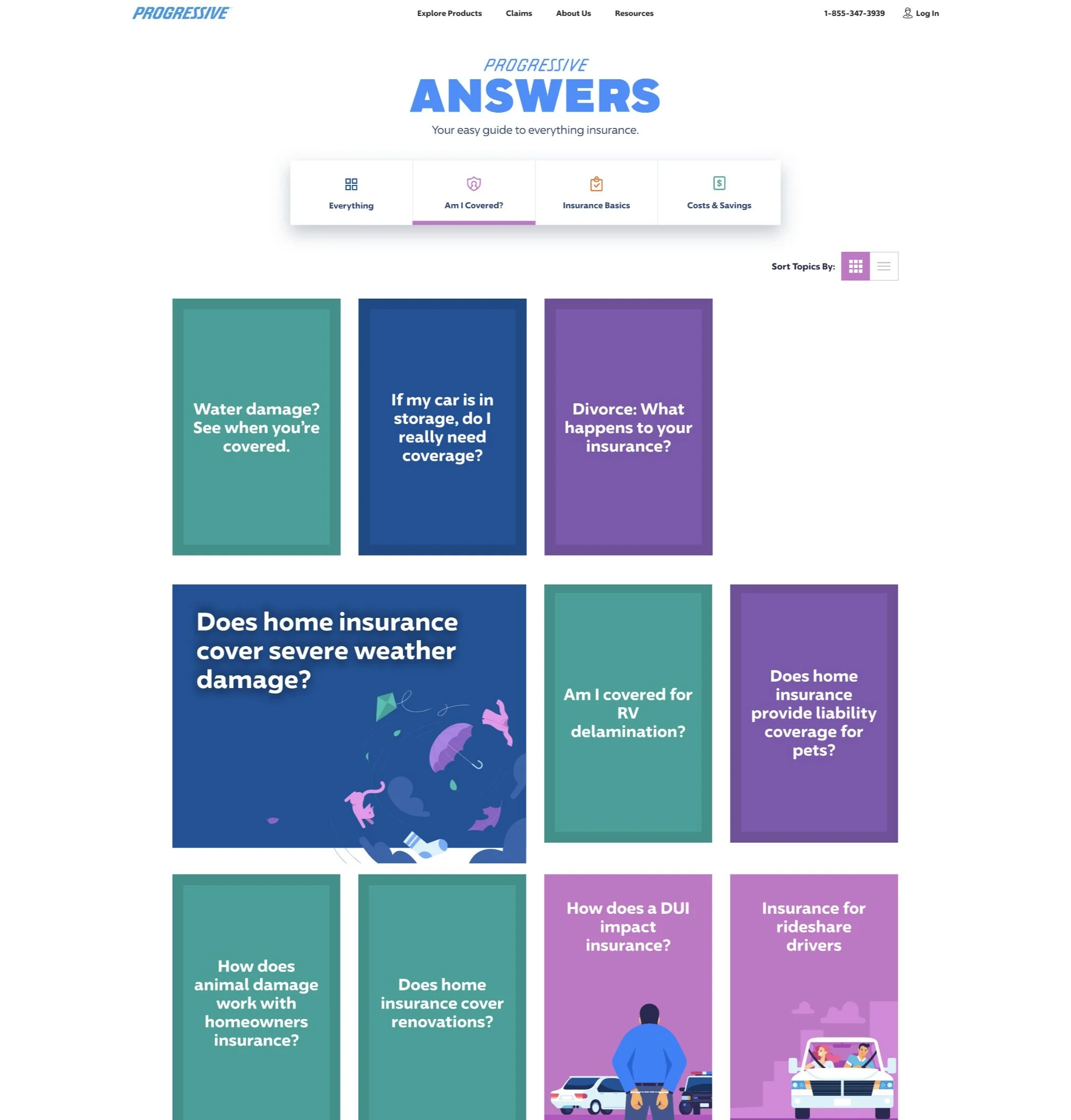
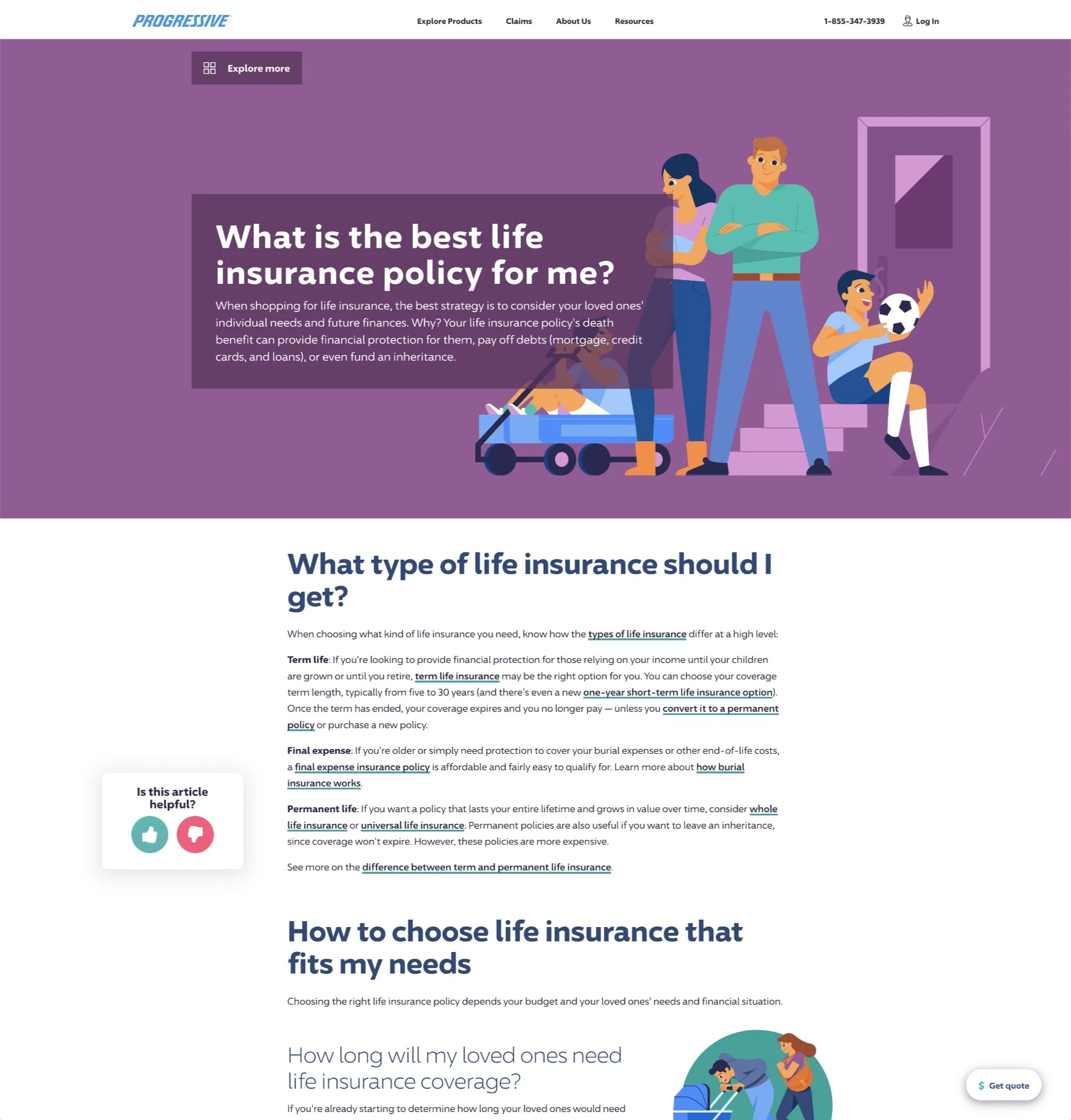
Progressive Answers is a centralized hub created for customers, new and old, to find easy explanations for their questions about insurance coverages, pricing, and more. Progressive® Answers
Create an experience where users can quickly and easily find answers to their questions about insurance.
Increase organic search ranking by elevating engagement on all page levels with enhanced information architecture, increased keyword opportunities, and a platform designed with future growth in mind.
PROJECT GOAL
Lead designer working with stakeholders for feedback. Key roles include UX/UI design, wireframing, user testing, prototyping, design documentation for development handoff and front end QA.
responsibilites
Old Answers legacy design
The old answers experience was designed and built to accommodate just a handful of articles and related content. The lack of filtering and minimal opportunity for organic discovery limited the experience and no longer supported the broader content goals of Progressive.

Identifying pain points

Header carouselCarousel data indicated minimal to no engagement on the slides not in immediate view.
Limited keywords and on-page content did not fully take advantage of the SEO potential.
SEo ConsiderationsOverly simplified grid of latest articles on homepage and topic landing page without much opportunity for organic discovery.
Limited room for growthUX wireframes
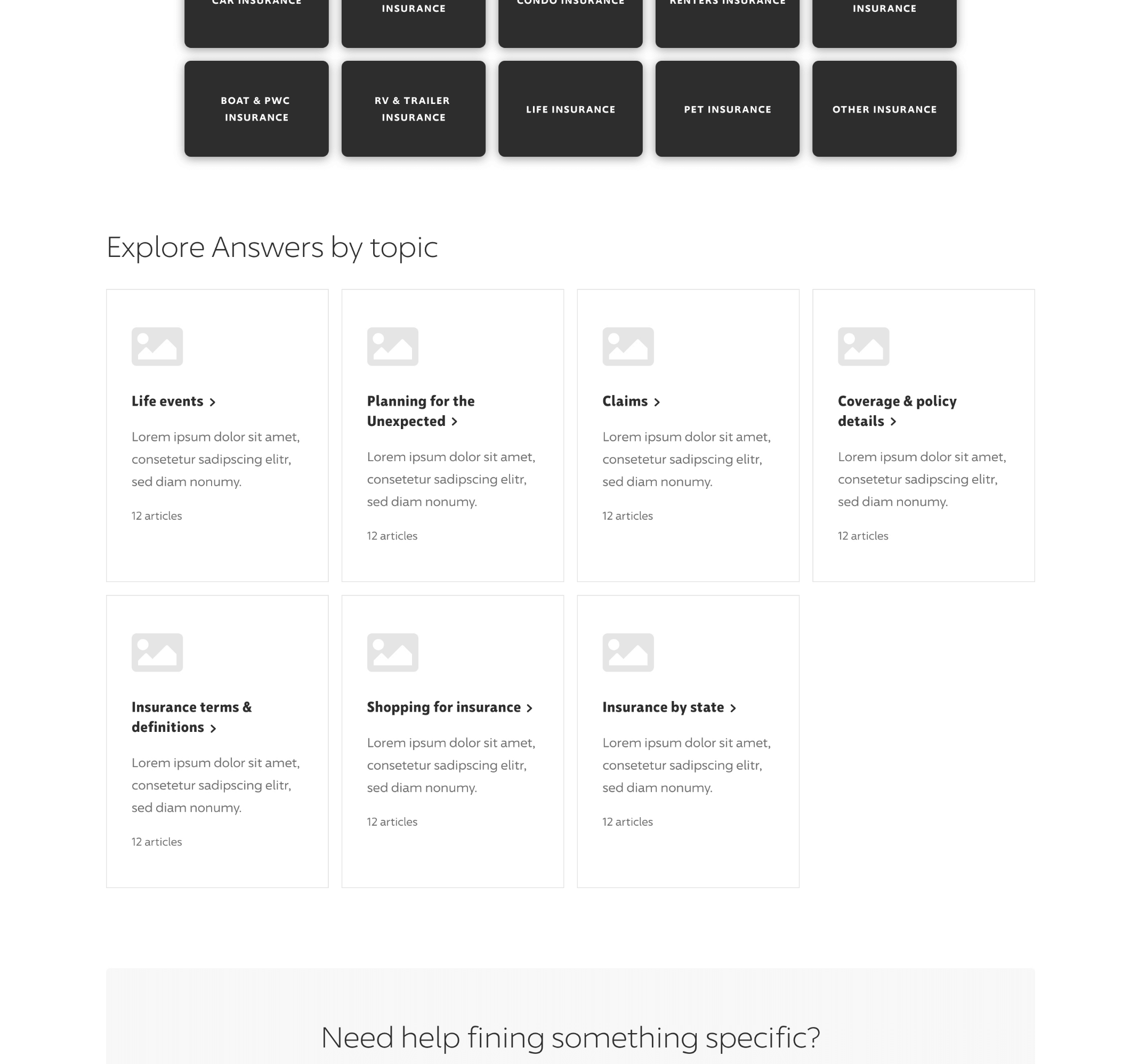
Two distinct homepage wireframe concepts were taken to our usability lab to unveil the types of coverages users are looking for, how users find specific information, how they act on new knowledge (quote-start) and how they orient themselves within the unique answers experience.


Key elements

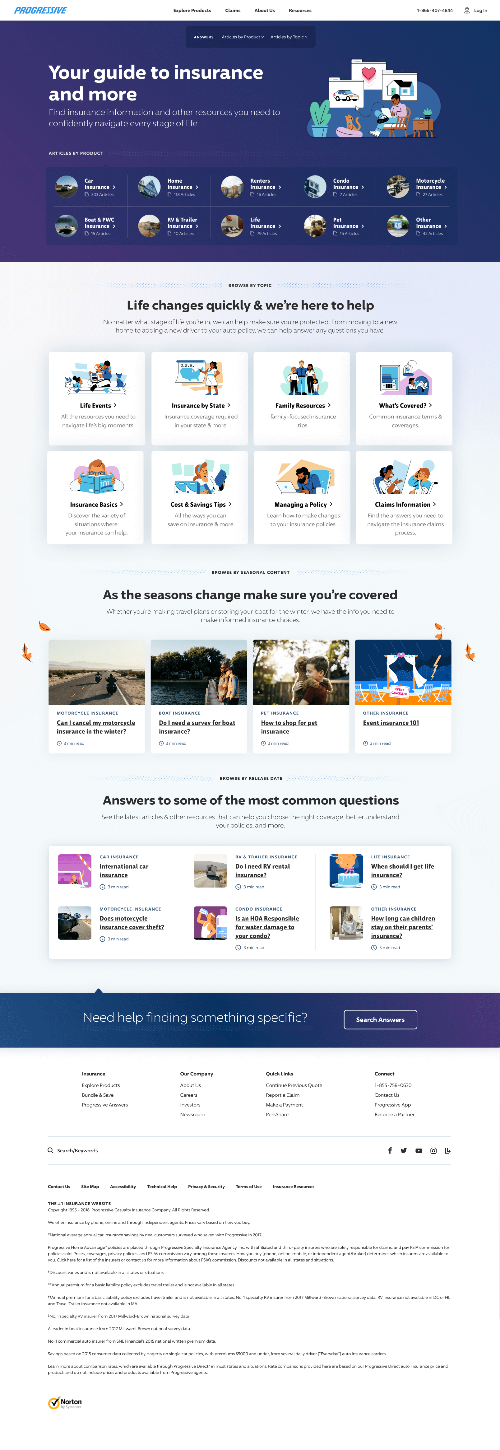
Exposing the local navigation on page creates awareness of the different types of information on the site.
Exposed local navigation + search

Seasonality wins have been historically proven with messaging and imagery on progressive.com. A dynamic seasonal section is a way to carry over those wins into Answers.
seasonal content 
Additional entry based on topics
General topics create another defined entry point, besides just products, for users to dive deeper into the site.
High fidelity Buildout
With our findings from usability, we took the best parts of both UX concepts and applied our learnings to create a structure for the end product. Using Progressive’s existing design system as a baseline, we established a visual identity rooted in brand consistency. The visual experience acts as a sister site to Progressive - individual in identity but still clearly part of the Progressive digital family.

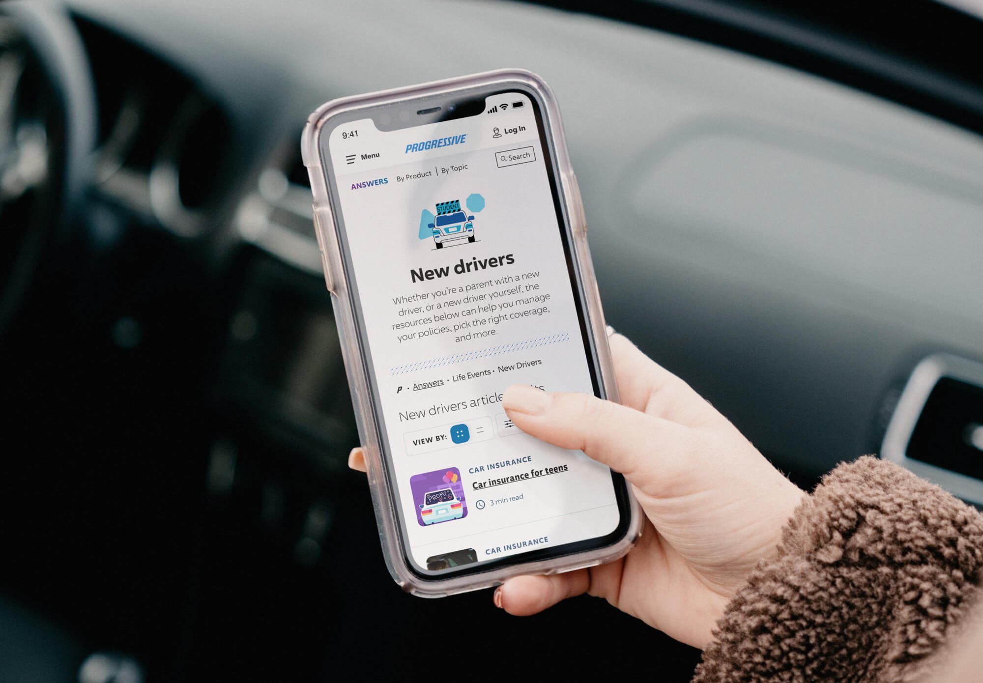
A scalable + dynamic mobile experience
Tablet and mobile designs were created in conjunction with the desktop layouts to ensure a seamless and engaging experience across all devices.


Project Outcome
40+
Dynamic design components built to scale seamlessly on all devices
1150
Articles at launch made easy to navigate through topic and product filtering
15
Unique page templates designed to scale for desktop, tablet, and mobile

